Burger Culture
Burger Culture is a new fast-food restaurant which has opened two branches in the national capital region of India. The team is full of enthusiastic folks who are seekers of quality and thorough lovers of burgers!
They came to me towards the end of 2020 and we worked together to create a fun, vibrant identity for the brand to fully translate our collective love for burgers.
At A Glance
001
Client
My Role
Singlehandedly learnt the clients’ vision and translated them to well defined needs.
Created a brand design system (colors, fonts, style of imagery)
Coordinated with cross-functional teams (manufacturers, material experts) for packaging printing
Worked on logo, packaging, menu and staff uniform design.
Wrote the brand copy for the physical restaurant space, staff uniform and menu.
Created high-fidelity mock-ups to present variations of designs
Designed the pink neon sign (in-store) by creating mock-ups to explain the look and feel to the owners
Duration
Tools
Adobe Illustrator, Adobe Photoshop, Figma, Adobe After Effects
Domain
Brand Design
3 months
Brand Guide
002
↑
↑
↑
↑
↑
Burger Bun
Cheese Slice
Patty
Veggies
Ketchup
Color Palette
Created keeping in mind the colors that are most easy to associate with a burger.
I’ve used black as an auxiliary color to ensure a high level of contrast between the colored backgrounds and text to ensure the text at all times is readable and accessible.
The red and green were added as secondary colors because I was designing for a food brand it and the food packaging would need a distinction between vegetarian and meat options.
Typefaces
←
←
→
→
Logo
Menu (Sectional Headings)
Menu (Item Lists)
Menu(slogans and one-liners)
Logo Design
003
The first step to crafting the brand identity was to establish a logo. The team was circulating between several names and upon discussion we zeroed down on Burger Culture. The text of the logo is stacked to look like the patty of a burger with the lines above and below it as abstractions of the bun.
I initially created a two-line logo but I realized that the positioning of it might be difficult in certain spaces. In order to increase flexibility I created a one-line version of it which was then places on the restaurant head-board.
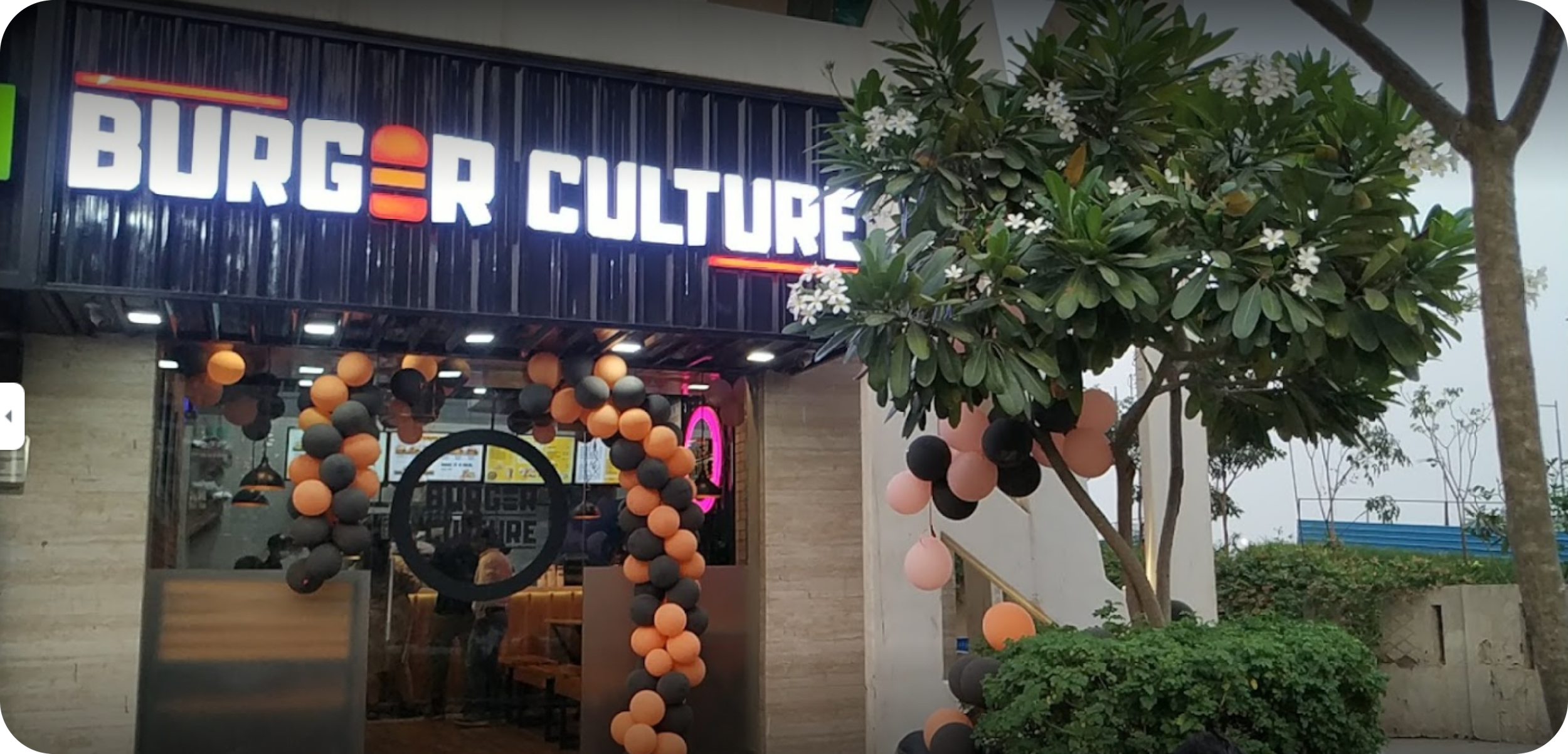
Pictured on the right is a photo of one of the branches of the restaurant in Noida, India.
PACKAGING Design
004
Packaging design was a rigorous process as I waded through figuring out the best usage of the colors and brand motifs while ensuring that its all fully functional, not wasteful and visually pleasing. Here I share with you the mock-ups, product photography and images picked up from customer reviews on Zomato.
Another reason why it was tremendously fun working with the team of Burger Culture was the amount of freedom they gave me in terms of ideation and time to find what suited best.
My role involved communicating with the printing vendors and sharing the designs with them on the keylines for each item.
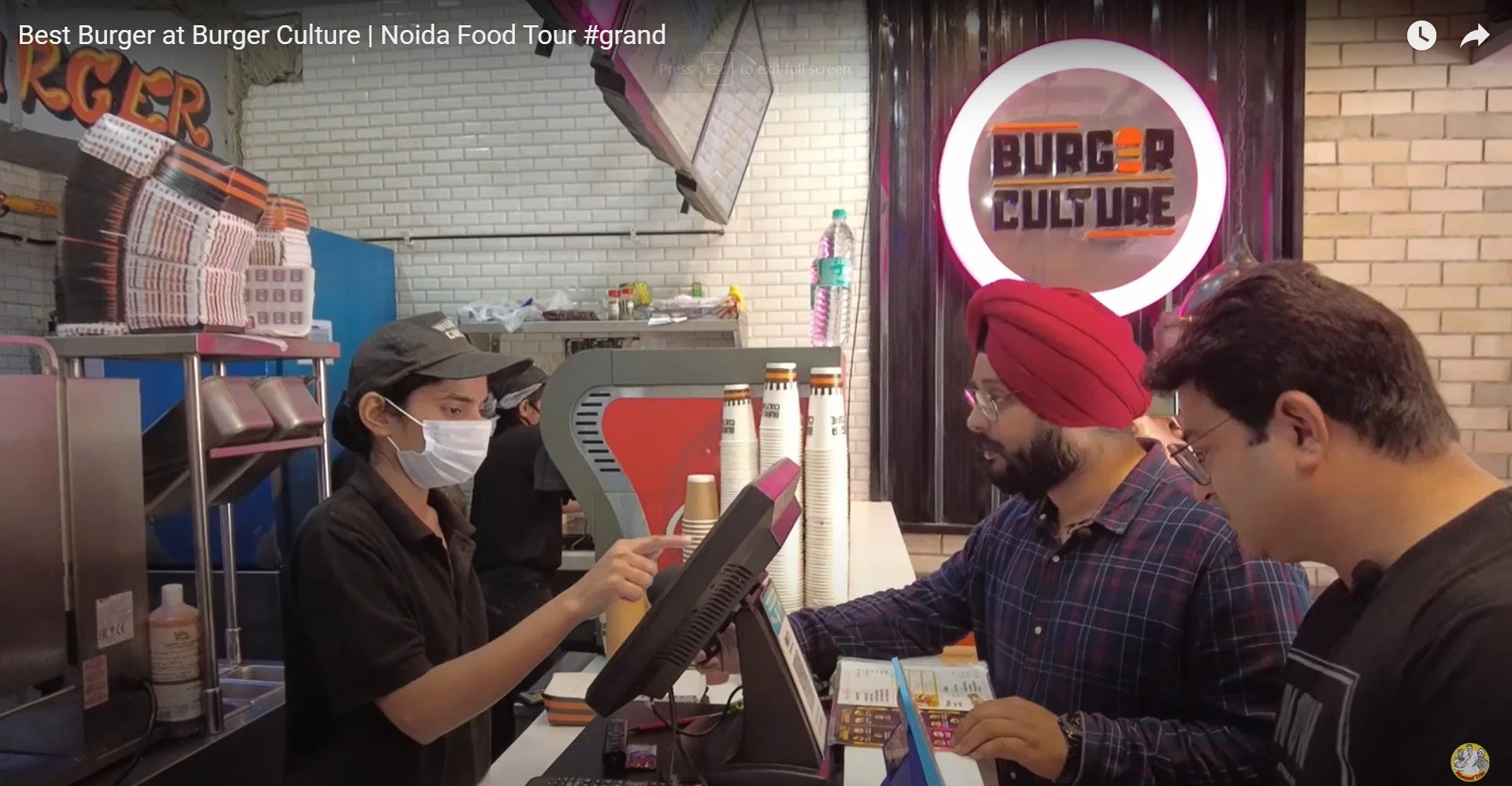
The food from the restaurant has been reviewed by a couple of food bloggers and it shows the packaging material in full view for you to gauge its aesthetics and functionality.
You can take a look at the various iterations of the packaging here in this video.
Menu DESIGN
005

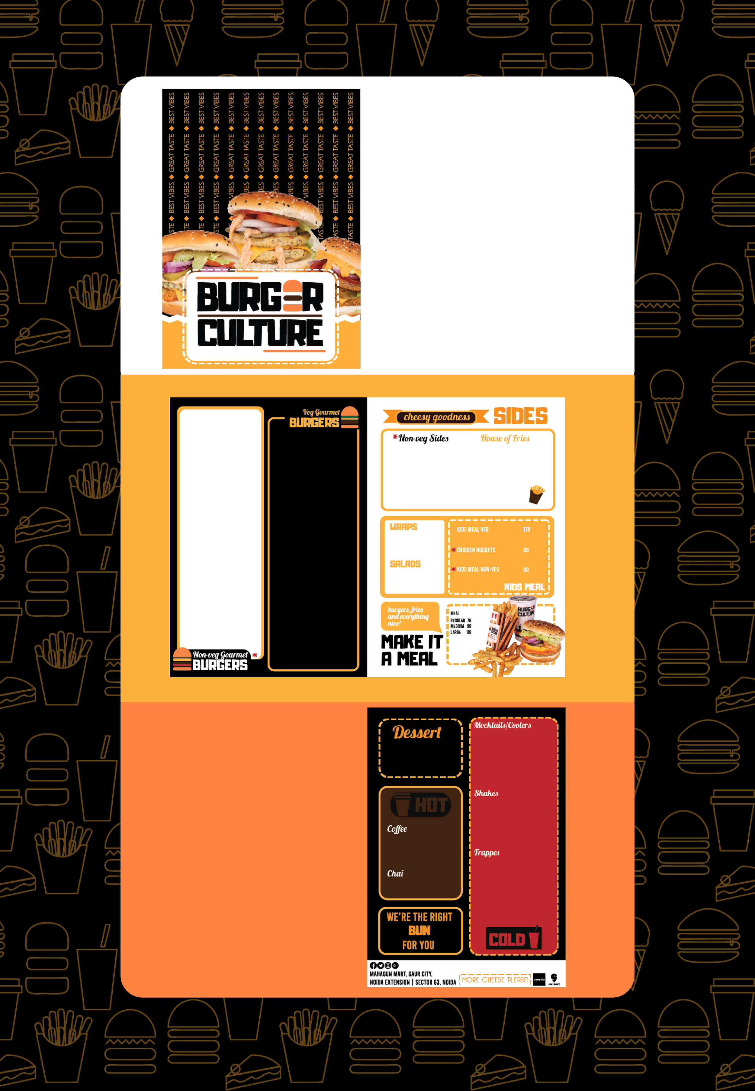
I designed the template for the menu. I’ve shared the skeleton here.
This was designed using real text and keeping in mind the space required for the number of items per category. I’ve removed the item list and prices here based on the request from the team.
It’s this last page that I was most skeptical about and using the color brown. In retrospect I would probably change the theme of this page and remove the brown and red and replace it with a white base.
STAFF UNIFORM DESIGN
006
Working on Uniform Design helped me dip preliminarily into fabric design which opened a whole new world of potential and constraints. I had to design keeping in mind how the color will play out on the fabric being chosen and also limit the colors as per the clients budgetary constraints.
Brand Copy
007
Since I was working on the project independently, I was also copywriting for the brand. Here are a few samples of the work I integrated with the design.
WHAT I LEARNT
008
Working Independently
Considering Constraints
Budgeting Time and Deadlines
How it feels is just as important as how it looks
This project was spearheaded by me alone, over the course of 3 months and I’m extremely proud of it. Not only did I get to work for a client who loved burgers as much as I do, but I got to expand the length and breadth of my potential.
I have worked in many teams over the course of my life and this was one of the biggest projects I handled by myself which felt like an accomplishment. Even then, I did find myself collaborating with various stakeholders such as a food material experts, the printing vendors for packaging and fabric, the clients marketing team among others and it was a beautiful learning experience which has set me up for success for all of my future endeavors.
The design scope of this project involved a spectrum of different fields of design ranging from digital, packaging, fabric and that each branch came with it’s own constraints. This was the first time I worked on keylines and that was a great learning curve as well.
I’m extremely grateful that I got to dip my toes in each of these different styles of design and was able to explore the advantages and limitations of each.
One of my most crucial learning experiences was how to project my timelines, how best to manage my time and how to budget for unanticipated errors (the number of times my software has crashed during this project has got to break some kinds of records!).
I was also working with very old tech at the time and my laptop was not in the best condition to design. These were all issues that I learnt how to account for and plan ahead in order to circumvent. I created lots of high-fidelity mock-ups and found out very quickly that clients are more open to looking at options when they’re presented well which can help save on multiple iterations of designs.
The most important thing to crack was the color palette and the logo because it had to be fun. The brand needed to immediately appeal to a crowd that was young and grab their attention.
I couldn’t zero down on the logo and the palette until I reached this and was finally convinced with how it felt to me. This immediately resonated with the client as well and it was great working with people who understood the importance of taking the time to get the feel just right.


